


At some point in their career, every Salesforce Admin or Consultant has sat down with a senior stakeholder and been presented with an objective to make ‘data work for the company’. Usually, this conversation is followed by numerous discovery meetings and pages of user requirements. In the coming weeks, a barrage of scheduled reports and dashboards are built. This quick win is usually followed by dissatisfaction and a string of complaints in the following months.
It can be hard to understand what could possibly have gone wrong when you built a report or dashboard that exactly matched requirements. In this article, we’ll dive into the reasons why no one looks at your reports or dashboards, and what can be done to increase adoption!
It’s Hard to Get to the Data
Even if you build the most impactful dashboards or reports, usage can be hindered if your users cannot access them. There can be many barriers to access – from naming conventions to folder access, if your user needs to keep asking you for the link or cannot find the report by searching, then it is clear that your data is being less impactful.
While it may seem tempting to passive aggressively pelt them with a link (the way you would give Wi-Fi credentials to a free-loading friend!), this may not be the answer to the underlying cause at hand. Think carefully about the whole journey your users take when accessing data and explore any possible areas of friction.
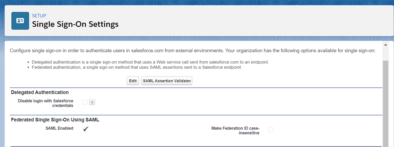
Come up with ways to make it as easy as possible to access reports and dashboards. For example, enabling SSO in your org, embedding vital reports on the homepage, or training users to use the “favorite” feature in Salesforce. While these seem less important than building the data itself, if your users can’t access the information, you may as well have not created it.
While writing “Contact Report for John” may have seemed like a good idea at the time, a stagnant contact report for a former Salesforce manager is another reason why individuals will have issues navigating through your reports. Standardize your report and folder naming conventions, leverage subfolders, and check users only have access to the folders they require to improve the navigation experience. Be sure to regularly audit your reports and dashboards, otherwise they tend to get out of hand quickly.
While this may start to sound more like a Christopher Nolan film than a Salesforce blog, you can report on your reports. It’s a good idea to get your super users or power users involved to spread the workload as well.
Before you make any significant changes ensure you are backing up your reports if there’s any change they could be of value, as they are not included in your weekly backups!
Erroneous or Poor Quality Data
It only takes one user to notice the test account you forgot to exclude in your report to question the validity of your data and analysis.
It’s best to remove erroneous data from your org but, if it is needed, think about adding some tags onto these ‘test’ accounts, contacts, opportunities and so on, that can be selected in a report and excluded through a filter.

Also, as much fun as it is to create a ridiculous name for test data (and I have been a huge fan of this practice in the past), clearly labelling test data allows you and your users to more easily disqualify that information when it arises.
Think through your data quality strategy and ensure those central themes (such as requiring email and archiving old data) are being incorporated into your data quality reports. On a regular basis, make sure these reports identify errant records, and ideally implement validation rules to stop the flow of incomplete data into your org. However, be mindful of using placeholders in required fields such as “notsure@email.com”, as they may mean you don’t have vital information later on.
Lack of Documentation
Depending on your audience and complexity of your org, developing supplemental report descriptions or documentation may be needed. A big question some users will ask is “what do I do with this data?” – it really boils down to the actionability around your metrics and if they are clear to your users.
Building out documentation on the fields listed, but also the associated metrics and KPIs, can be incredibly helpful in framing the ‘what matters’ of this data.
No Audit, Consolidate, and Purge Process
If you have ever stumbled across a dashboard for an initiative that ended three months ago that’s still going out weekly, then you have been burnt from not auditing your reports and dashboards. It’s not unusual to get a multitude of reporting requests for a ‘highly important strategic initiative’ that ends up getting dropped in a few weeks. While it is quite easy to become embittered about these situations, proactively addressing these shelved reports will be a starting point in increasing reporting adoption.
If a senior executive is receiving 10+ reports a day and only 5 are relevant, it is quite plausible that they are going to glaze over the important data with the amount of analytical noise in the air. The auditing process can begin by simply asking questions, such as “I have noticed that you are getting eight reports weekly, do you need all of these? If not, my plan is to consolidate them into two.”. By having this conversation, you can quickly understand what information is being used, and what can be modified or removed.
Psychologically speaking, users feel respected and seen when these issues are brought to their attention, and this indirectly improves the reputation of your instance too. People will always conflate metadata with actual data when they say “Salesforce has garbage”, but they are really referring to a report they receive with old or out of date information.
By scheduling quarterly time to a) remove old reports and b) consolidate existing reports, the amount of noise will be managed and reduced. It’s not hard to understand that navigating to a single dashboard is far more beneficial than toggling between four or five to manage relevant KPIs.
Summary
None of these steps are that exciting or revolutionary, but they are constant blockers to report and dashboard adoption. Chipping away at these issues will lead to great things over time as access and adoption will improve, enabling you to build a stronger operational culture of data-empowered decision making.
Comments: