


Salesforce are on a mission to help companies deliver engaging mobile experiences to their customers and employees by taking steps to make configuring the Salesforce Mobile App fast and low-code.
The good news is that all Salesforce apps automatically work on any mobile device, which removes the traditional hurdles companies faced when going mobile. However, with limited space on a mobile interface, ensuring you are customizing your Salesforce mobile UI (user interface) with best practice in mind can have a huge impact on user productivity and mobile app adoption: “plus, it’s quick, free, and is so easy that even the newest of Admins can do it!” as Stacy said in her recent post on general Salesforce UI/UX best practices.
Let’s see which features and tricks you should use when designing your Salesforce Mobile App.
Questions Before You Start: Who, When, What
Before you start configuring your mobile pages, you first need to do some discovery – just like you may have written user stories during your main Salesforce implementation.
Learn about the different audiences (groups of users) that will use your mobile app. Understand the patterns of usage because these may be different from how your Salesforce users will use the Salesforce on the go vs. when they stay put at their desks.
1. Preview Mobile Pages in the Lightning App Builder
Salesforce transitioned to the new Salesforce Mobile App in 2019. The move meant Salesforce extended their framework to deliver specific mobile pages within the App Builder, using point and click building (no code required!)
As you will see, when you create a new Lightning page in the App Builder, you can select the page layout from a menu. You can see how the selected layout will reacts on mobile, and how the page modules reorganise:
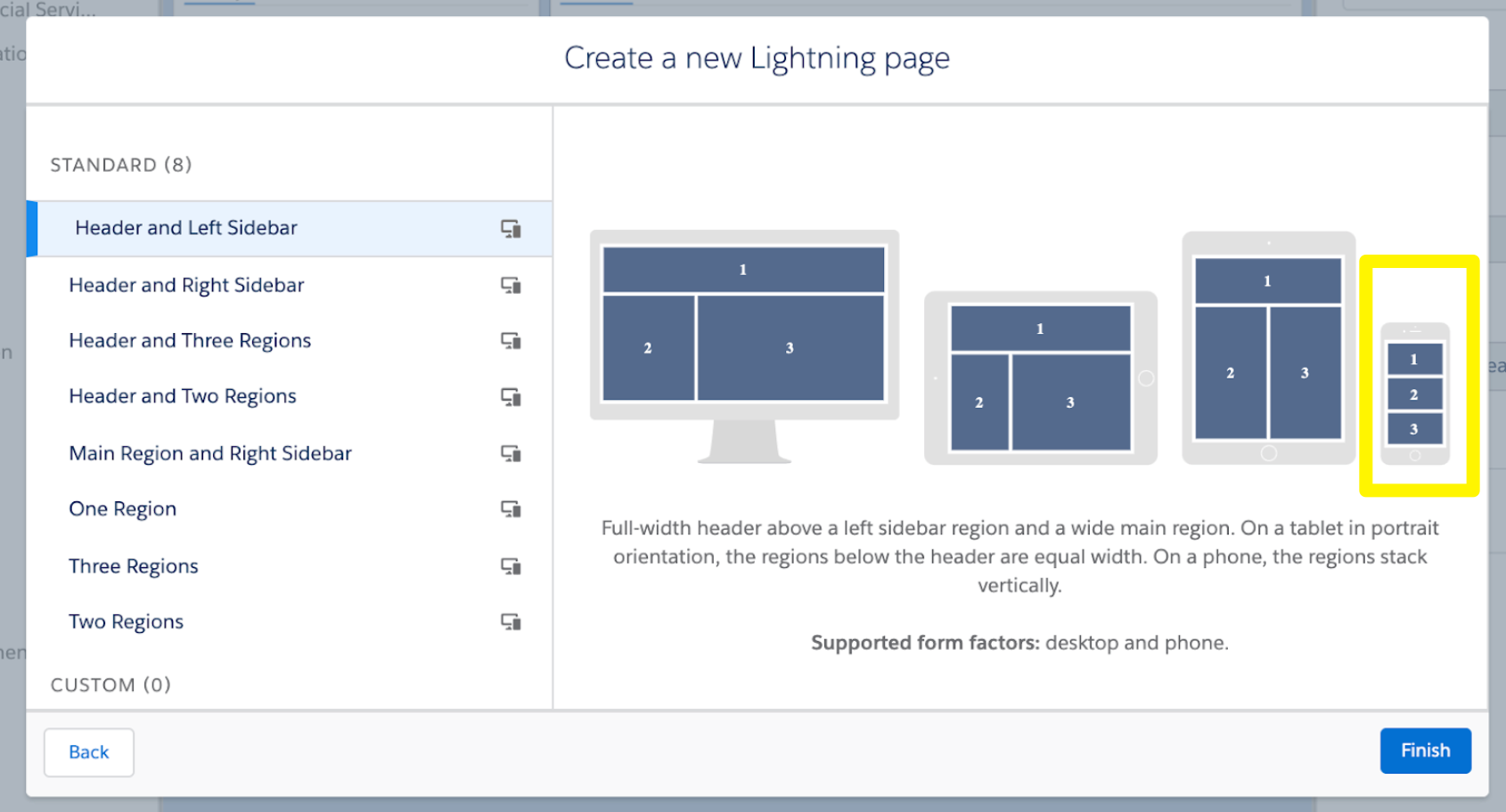
Take advantage of the real-time rendering in the App Builder to visualise how it will look:
The new user experience on the Salesforce Mobile App obviously comes with great advantages, too. It keeps the same look and feel as your desktop Salesforce (familiarity is key for your users), and also built on the Salesforce platform guarantees security, removing the need for Admins to worry about this.
2. Customize the Mobile Only Default Navigation Menu
The ‘Mobile Only App’ is the default view for the Salesforce Mobile App – in short, it’s the list of items that users see when they tap ‘Menu’. You should customize the Mobile Only default navigation menu (Setup > Apps > Mobile Apps > Salesforce > Salesforce Navigation) to ensure users see only the items they need on mobile – but pay attention to the top 4 items, as these will also appear along the bottom navigation bar throughout the app.

Source: Salesforce
3. The Action Bar & Global Quick Actions
Usability is key for your mobile app. What I mean by this, is removing as much friction for your users to accomplish a single action end to end, such as reducing the number of clicks, fields to complete, and screens to go through.
Let’s turn our attention to the Action Bar. It appears in most places in the mobile app, including standard and custom object records, related lists, search results, the feed, groups, user profiles, dashboards and reports.+

The Action bar adds Quick Actions to your pages, such as ‘Log a call’, ‘New case’, ‘Post’ to Chatter. The actions that are available depend on which page a user is currently on in the app; you may have customized page layouts and publisher layouts for your org, which is how the actions available to your users will differ from page to page.
Leverage automation with Global Quick Actions to eliminate unnecessary steps and simplify navigation. Only surface the Quick Actions that are key; think about the essentials for your users on the go. I always recommend productivity actions like log a call, and any custom buttons for a specific object that you have added to your org.
4. Compact Layouts
Compact Layouts enable you to highlight key fields in the header of every record page. It’s especially useful for mobile users who need to get that information quickly!
For each object, you can assign up to 10 fields to display in that area (including the Name field, which is required).

Source: Salesforce
5. Show and Hide Mobile-only Components
How do you prevent mobile pages from becoming too cluttered? How about hiding parts of the page that only some users need, for the rest of the users that don’t need that information?
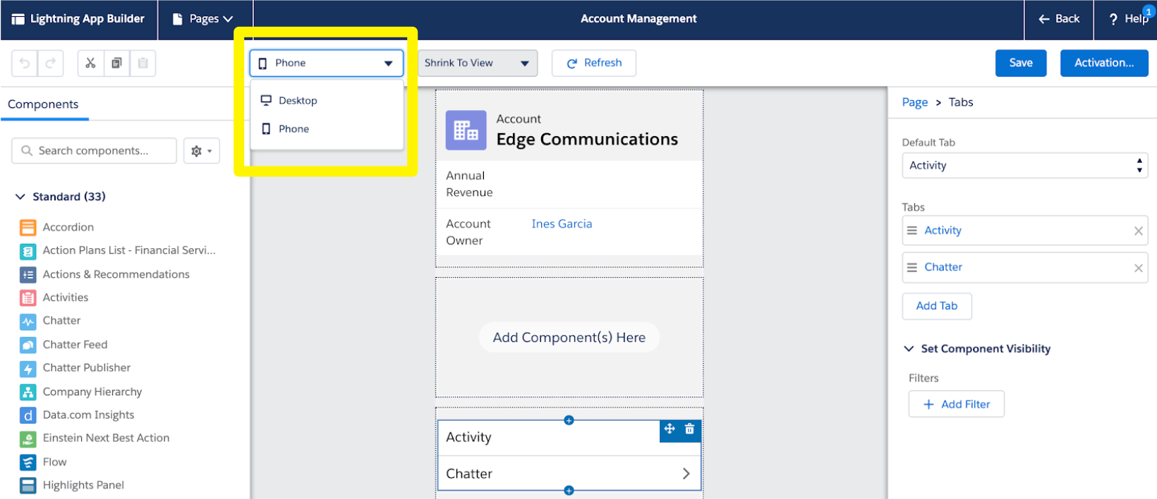
Remember the ‘Set Component Visibility’ functionality in the Lightning App Builder? Not only can you set which users should see which component, you can also define visibility by device! And just like this you can show and hide components for mobile pages.

Mobile UI Design Best Practices – My Tips
- Less is More
The rule of less is more is even more important on mobile.
This mantra is so on-trend that in UX design nowadays, the practice is to have a mobile-first design, which means starting your application design optimised on the smallest possible device, then grow to larger screens as a secondary design.
Think about which UI features won’t work well on mobile; this would include any popups you may have on your desktop Salesforce.
- Responsive Design
Known as responsiveness, this relates to how the modules on a page reorganise from one device to the next (as we saw with the Salesforce App Builder earlier in this post). Content displayed automatically adjusts it’s sizing, layout, and proportions to display in a readable manner on the user’s device.
Are your page modules in the right order when viewed on mobile? For example, has a component slipped too far down the page, which would cause users to scroll too much?
- Usability: Reduce Clicks and Screens
Usability is key for your mobile app. Again, remove as much friction for your users by reducing the number of clicks, fields to complete, and screens to go through. Quick actions and the Action Bar are the way to do this.
How intuitive is your Salesforce mobile app to use? If you have new users, they are a great group of people to ask to get some feedback, as they will be learning how to use your Salesforce org from scratch.
Summary
The good news is that all Salesforce apps automatically work on any mobile device, which removes the traditional hurdles companies faced when going mobile. However, with limited space on a mobile interface, ensuring you are customizing your Salesforce mobile UI (user interface) with best practice in mind can have a huge impact on user productivity and mobile app adoption.
That’s only half of the stroy. You need to know your users and their work patterns. Keeping things minimalistic and simple is good for them (and for your future self to not get bogged down by support requests).
Finally, a personal motto and bonus tip from me, stick to out of the box functionality as much as possible. As you start to move away from standard Salesforce, there are some things to be aware of when developing custom pages for the Salesforce Mobile App – I will point you to the Salesforce Knowledge Article to look at that further!