


Customizing your Salesforce UI (user interface) can have a huge impact – plus, it’s quick, free, and easy enough that even the freshest of admins can do it! User experience can truly make or break a system. There’s an incredibly high ROI on these Salesforce UI customizations. Improve the design and navigation for the user, and you’ll see better user adoption. Creating an intuitive, consistent interface that reflects positively on your brand or platform can actually improve their mood and willingness to use Salesforce.
User experience design for Salesforce is becoming an increasingly hot topic, with the Salesforce certification to cement its importance. In this guide, we’ll explore Salesforce UI features to implement in every Salesforce org, written in collaboration with Stacy O’Leary, who’s a certified Salesforce Administrator. Her motto? “Happy users mean happy org”.
1. Salesforce App – Adapt Your UI
Users want to feel as if Salesforce is adapted specifically for them. So in the first of many adaptations, it is a good idea to create a dedicated Salesforce app for each group of users or personas within your organization.
This will allow you to show a specific set of relevant tabs, as well as name the app after the group of users e.g. UC – Human Resources or UC – Marketing.

In addition to the app, you can also cater for your users using the Lightning pages, such as the homepage.
For example, if there are three teams working on Salesforce and they all need the same basic information on the homepage (Tasks, Events, Recent Items, and Chatter), but each team has a specific requirement in terms of the metrics they would like to see in a report.
Marketing Team: “I would like to see a report of my campaigns, but I don’t want to see any finance or sales information”.
Sales Team: “I would like to see a report of my leads by status, but I don’t want to see any marketing or finance information”.
Finance Team: “I want to see a pipeline report of all open opportunities, but I don’t want to see any marketing or lead information”.
Here’s the old solution:
- Create three homepages and assign each one to the relevant profile.
And the new awesome solution:
- Create one Lightning homepage, include all the common components, and add a unique report component for each team.
- Next, with a report component selected, click on “Set Component Visibility”.
- Select “Advanced” > “Field – Select” > “User” > “Profile” > “Name”, and enter the value of the profile (make sure the operator is set to “Equal”), then click “Done”.
- Repeat for all of the report components.
- Now the reports will only display for the relevant teams!

2. Themes and Branding
Themes and branding enable you to customize the look and feel of Salesforce to match the branding of your organization. You can add logos, default images, and colors.
Navigate to: Setup → User Interface → Themes and Branding.

Custom Hyperlink Color
You can also customize the color of any hyperlinks in your org.


3. MyDomain Logo and RightFrame URL
The login page is the first place a user interacts with Salesforce – and an opportunity for you, as the admin, to customize the page.
You can choose not to customize the login page and let your users log in here.

Yes, fine – we’re all here because we love Salesforce. But this login page is boring.
Alternatively, users could log in to a page like this:

The second login page is better because clearly, you can tell it belongs to my company – it’s unique and distinguishable from any other company’s Salesforce login page.
The max dimensions for the logo are 250px by 125px, and no larger than 100KB.
You may need to ask for a custom page to use as your right-frame URL, or even use your company’s webpage if you can.
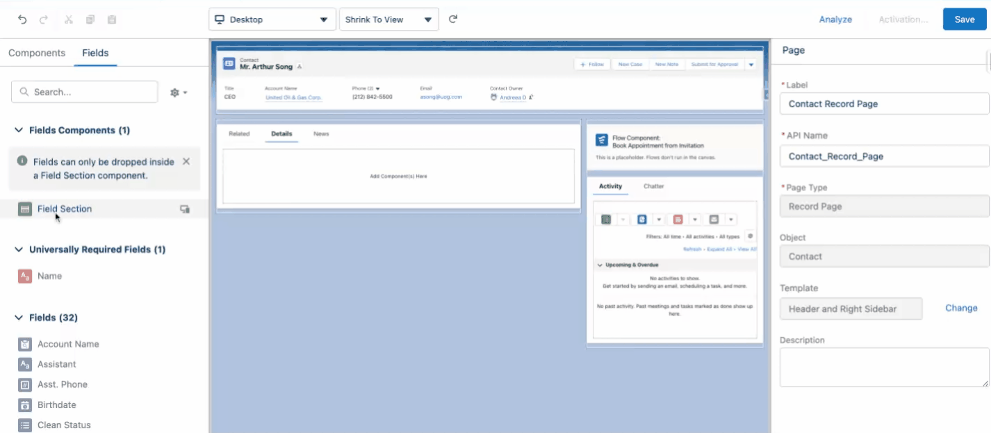
4. Page Layouts and Lightning Pages
Embrace the powerful Lightning App Builder to add, remove, or reorder components on a record page or homepage, creating intuitive and bespoke pages.
With Dynamic Forms being an absolute game changer to the entire experience, it would be a shame not to make use of this functionality.
Long story short, you can add sections where you can tweak the visibility of every single field based on criteria, such as the value in another field and more!
This functionality is not something available within page layouts at all (unless the field is either not added to the assigned layout or the user doesn’t have permissions to it). So if you needed one more reason to migrate to Lightning, this one is certainly worth nothing.
5. Compact vs. Comfy Navigation
Salesforce offers two display densities that can improve navigation:
- Comfy: A spacious view that takes up more space, with labels on the top of fields and increased space between page elements.

- Compact: A denser view with labels to the left of the fields and less space between page elements.
The compact view can drastically reduce the need to scroll for information. So, once you go compact, you never go back!

6. Compact Layouts
A compact layout displays a record’s key fields at a glance in both the Salesforce mobile app and Lightning Experience. They also work when you hover over a master-detail or lookup field in Salesforce Lightning. Give more with less!

Perhaps lesser known but quite similar to the compact layout in the sense of only showing a few fields, the ability to decide on the related list columns is something you should also consider when thinking about the user experience. For example, when looking at the opportunities related list on an account, users might find it more insightful to view the forecast category first and then the stage.

7. Conditional Lightning Page Components
One of the main benefits of Lightning pages (versus traditional page layouts) is that we can significantly reduce the number of layouts required. Lightning pages support conditional components that can be configured to display (or not!) based on criteria that you define.
You could choose to filter component visibility based on:
- Field values
- Record type
- User profile or role
- Standard or custom permissions
- Device (desktop or mobile)
The possibilities are seemingly endless and super powerful.

8. Rich Text Components
Use rich text components to share a message with your team or include links to access information easily. You might use this on your homepage or a record page for:
- Important announcements
- Links to external folders
- Link to reports
- Picture celebrating the birthday of a user
- Salesforce user of the month


Here’s how to do it:
- Go to the Lightning page
- Select the “Rich Text” component.
- Drag it onto the page.
- Add your message.
- Press “Save”, then “Activate” – and voilà!
9. List Views
There is nothing more annoying than opening Salesforce and having a ton of list views to scroll through to find the one you or your users want!
Organize list views according to the goals of the team’s work – this can be achieved using proper naming conventions and numbers to create a logical sequence.

Additionally, keep track of users with the Manage Public List Views permission. This authority should not be assigned to everyone in the org, as it allows editing all publicly available list views. If someone added an extra filter on a list view available to everyone else, this might just be the reason.
10. Salesforce Path and Guidance
One of my absolute favorite user experience features! Salesforce is more than a database full of fields to collect endless data. Salesforce is designed to streamline processes, automate, and improve ways of working.
Path allows the admin to guide users through the steps of a business process, such as working an opportunity from a fresh lead to a successfully closed deal. At each step of a path, you can highlight key fields and include customized guidance for success.


Additionally, users can directly edit the available key fields within Path, removing the need to navigate further down on the layout.
11. Salesforce Celebration
Celebration is a key feature that demonstrates the importance of user experience and how much importance Salesforce places on creating an engaging interface.
Salesforce Celebration empowers admins to interact with users in a fun, visual way to celebrate wins – and it’s so simple to set up! When creating your Path, you choose at what point and how often to display confetti. For example, you might choose to rain confetti every time an Opportunity Stage is “Closed Won”.

The first time I implemented this for a client, I immediately had a call asking if it was normal – because, in her 15 years of experience working with CRMs, she had never seen anything like it!
12. Keyboard Shortcuts
If you have teams working with multiple cases at the same time, then this feature is perfect for you. Salesforce supports multiple keyboard shortcuts to improve productivity and help users work more efficiently.

13. Icons and Image Formulas
A user-friendly way to display information is with the use of icons – such a simple thing, but it can completely change the user experience. Here are some examples of where icons can be used:
List View: Add an icon while you write the list view name.

List View Records: Add your formula fields to the list views (check out the Channel column!).

Record: Have formula fields with images on your record page to represent information.

Report: If your users are more familiar with using reports rather than list views or checking out individual records, there’s no reason why they shouldn’t benefit from the formula – even as a grouping!

14. Validation Rule Message
Validation rules are an extremely effective way of ensuring that the information entered is in the right format before the user can save the record. This leads to cleaner Salesforce record data.
Since we have to create an error message, we might as well make it entertaining!

Additionally, for even more complex messaging and an easier way to achieve complex validation rules without Apex – as of Winter ’24 – the new Custom Error Flow component will definitely become your go-to for these scenarios. By using this new addition, the error message is no longer only plain text, as it can also reference field values or resources from within the Flow.

15. Search Layouts and Search Filters
Search results and filters – if you do it right, no one will know you’ve done anything at all – they’re just one of those things! Ignore them completely, and your users will be unhappy with Salesforce (but they won’t know why they’re unhappy with Salesforce).
Search Layouts
We’re all familiar with the global search at the top of the page, but if you haven’t customized the search results for each object, then you might be letting your users down.
Take Opportunities – sales reps, VPs, sales operations, and even customer support probably search for an Opportunity multiple times a day.
Here, I’ve searched for the term “United Oil” and have ended up with some search results that are almost impossible to tell apart from each other! You know this will frustrate your users, who will probably click on each record.

However, if you customize the search columns, you can display relevant information to the end user immediately.
All I did was modify a couple of columns, get rid of “Account Site” because this org doesn’t use that field, remove “Owner Alias”, and replace it with “Owner Full Name”. I’ve also added columns for “Type” and “Amount”.

Now it’s much easier to tell these apart from one another! You’ll want to do this for every object in your org – especially the primary ones your team uses.
Search Filters
Search filters add another layer to the users’ search capabilities. The filters on the left allow me to narrow down my search based on the criteria you select.

16. Einstein Search
Available directly within the global search at the top of the Salesforce screen, Einstein Search generates results immediately as you click on it or start typing. It offers the possibility to use natural language for broader searches – for example, “My Accounts” or “My Leads” have never been easier to find.
As of Winter ’22, Einstein Search is also turned on by default; hence it’s only a matter of getting the information out there and tweaking the settings as needed.

17. Letterheads and Email Templates
Letterheads (for classic email templates) can be found by navigating to: Setup → Letterheads.
First, add your logo to a documents folder, and make it external facing.

Once you’ve uploaded the logo, you should create some general HTML email templates for future usage.


18. Screen Flows
The possibility of having guided wizards for various processes across the organization is sure to sound appealing to both admins and users. Screen Flows allow control at every step of the way – varying from simple filters for when and if a field should show up to background automations, default values, and more recently, on-screen formula reactivity.
Screen Flows can easily be added on Lightning pages for users to make use of such step-by-step screens either on their homepage or, why not, on standard and custom object records directly.

19. Elevate Your Dashboards with Image and Rich Text Widgets
Available for all Salesforce editions (starting with the Spring ’24 release), including text and image components as widgets alongside the usual report charts within Salesforce dashboards can take your out-of-the-box analytics experience much further.
This change also resulted in the number of components being increased to 25 in total! Take a look at how the new widget options look in the dashboard below, and be sure to check out this dedicated article to learn more about the available options and key considerations.

20. Inline Editing
Last but not least, inline editing could not have been skipped from this list. While it may not be something to actually implement as much as it is a user enablement task, the ability to edit records directly in list views and reports, as well as the new Sales Cloud Everywhere extension Workspace option will increase productivity and lower the number of clicks for both new and experienced users.
Each option has its own considerations, such as the edited fields being available on the page layout or not being a long text area. Users have the option to pick and choose which one to use as long as they know these options exist.

Summary
User experience features should help you meet the needs of your users, and can truly make or break a system. Creating an intuitive, consistent interface that reflects positively on your brand or platform can actually improve their mood and willingness to use Salesforce.
This is by no means an exhaustive list. These are our personal favorites. I hope that you’re able to implement some of these in your own org.
Do you have a favorite UI customization that’s not listed here? Let us know in the comments below!